Wayfinding Bliss

Even repeat visitors to a commercial property, hospital or theme park may need a little help navigating the intricacies of a large complex. When designing any wayfinding program CNP Signs & Graphics works hard to keep visual consistency and simplicity throughout the process.

Simple, clear direction without confusing clutter
The recently completed Pacific Center business park in Sorrento Valley, CA is a good example of how uniformity can also be very visually appealing. Moving from the outside to the inside of the property, we will describe the elements and how they contribute to the success of the project. Experts at Stuart White Design conceived the project for the Pacific Center and CNP implemented two gateway monument art pieces at the entrance of the park. These monument structures are faced in black marble to tie into existing elements of the buildings in the complex. Two large entryway arches were also manufactured by CNP. These were the largest pieces in the project and are the focal point of the wayfinding system.
The size of the arches along with the design intent that they appear continuous when installed made it a challenge for CNP installation experts. Additional bracing and laser guides were employed to make sure the structures were installed plumb along the asymmetrical property entrance.
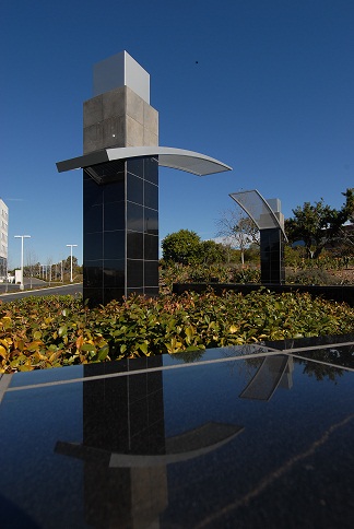
Arched entrance to the Pacific Center in Sorrento Valley, CA
Just inside of the monument signs and entryway arches, CNP also installed four primary directional signs and eight secondary directional signs to guide guests entering the property. These directionals contained design elements similar to both the buildings and the other signage in order to maintain design consistency.
Finally, two stone and tile monument walls were constructed with pin-mounted letters (“Pacific Center”) that helped identify the park from adjacent streets. Good wayfinding matches elements of the property and is properly spaced out to give drivers time to make necessary adjustments. Another element that makes a successful system is the elimination of clutter. Too much information can actually slow the flow of traffic in a complex environment.
Wayfinding achieves its goal when guests can determine where they are, where they want to go, and when they have arrived at the destination.
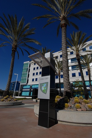
Clear information, clearly displayed defines good wayfinding
