Jack in the Box Re-Image Installations


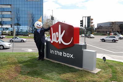
Jack in the Box is currently re-imaging and modernizing their exterior signage program to become more current and contemporary. These new signs started appearing in late 2008, and became the norm in 2010. Jack in the Box corporate worked closely with their designers and CNP Signs & Graphics to produce a look that was innovative and hip while keeping recognizable elements of the brand for the Jack consumer and allowing for rapid roll-out among their multiple national locations.
Jack in the Box, with over 2,100 locations in 18 states, has launched several new logo designs over the life of the company, averaging nearly one every ten years. CNP Signs & Graphics has been involved with each re-imaging project over their 60 year history with Jack in the Box and is proud to consider themselves a partner of such an evolving company.
Not only has Jack corporate strived to update the exterior look of the signs, they’ve also updated the materials used to make them. One major step included moving away from older illumination technology and ‘going green’ with the adoption of new, long-life Tri-Phosphor lamps to illuminate the ground signs and building signs. These lamps have a lifetime of approximately 5 – 7 years running at 8 hours a day (which is roughly 40% more efficient than the old standard fluorescent bulbs). The money businesses save on service calls alone makes these lamps cost-effective, as well as environmentally friendly. The tri-phosphor lamps are a relatively new product, and reflect both Jack in the Box’s and CNP Signs’ ability to keep up with new technology. In fact, CNP Signs & Graphics is one of the first major programs nationwide to use these lamps.
Jack in the box has always offered customers distinctive and innovative products, so why should their signs be any different? As they stay on the cutting edge of the quick service industry, CNP Signs & Graphics continues to work closely with them to make sure the re-image and store openings are completed on time. Next time you are by a Jack in the Box check out the K in the new logo. Doesn’t it remind you of a certain someone’s smile? Jack maybe?


