Category: Uncategorized
LED vs. Neon
71 years ago when Guy Taylor, the founder of CNP Signs & Graphics, was a master tube bender, neon was state-of-the-art. In fact, our name was California Neon Products, which described our business well back then. These days, even he would be excited about the future of LEDs (Light Emitting Diodes).
Neon will always have its place in the sign, art and advertising worlds. Nothing, including LEDs, can replicate the warmth and beauty achieved by neon. What is changing, however, is where neon needs to be utilized, and that is changing rapidly. Neon is still the preferred lighting medium for most open-face channel letters and other applications where the look of neon is necessary and desired. It may also be the better solution for very large letters, where the number of LEDs required may not yet provide the most cost effective solution, but even that will change soon.
Today CNP Signs & Graphics uses LEDs for almost all of our standard and halo-illuminated channel letters, and here’s why: LEDs allow faster fabrication of signs, they are easier to install with fewer and smaller penetrations in the building, they use low voltage wiring instead of the high voltage required by neon, thereby reducing fire hazard, and they eliminate breakage during shipping. LEDs also require less maintenance since factors such as wind, weather and vibration are harder on neon than on LEDs. Neon also costs more to repair than LEDs since workers need two trips for a standard service call (one to remove the defective neon unit and a second trip to replace the repaired unit).
CNP Signs & Graphics has been using LEDs for red channel letters for several years now since they’ve been both cost effective and reliable. Recently, with advances in brightness, color range, and longevity, as well as reduced costs, white LEDs have become feasible to use in white channel letters (and even cabinet signs), helping us to provide a more energy efficient and durable product. In today’s environmentally-sensitive world, energy conservation is a personal as well as a fiscal consideration and CNP is committed to a greener planet.
CNP Signs & Graphics has always been a leader in the use of new technology. First it was neon, then came fluorescent lamps, and now LEDs. Who knows what may be next, but you can be sure that taking advantage of the best products to fabricate the best signs possible for our clients is always our top priority.
All in all, our recommendation for the use of LEDs is, well, glowing.
Have more questions? Contact our Sales and Support Team.
Archive for May, 2010 CNP Designs and Donates Burton Snowboards FORE Charity

At CNP Signs & Graphics we don’t play golf for fun – we do it for charity.
Each year, two of our clients Jack in the Box and IN-N-OUT sponsor major charity golf tournaments, and we are more than happy to attend. Anything for the kids! In addition to displaying our stunning golf prowess, CNP Signs & Graphics also donates to the live auction at each event.
This year we were excited to team up with Burton Snowboards to create custom snowboards for the events. These amazing custom Series 13 boards, designed by Art Director Andy Wright, were handcrafted for each charity at the Burton Manufacturing Center and donated by CNP.
The Jack in the Box Charity tournament, held last week, benefited Big Brothers Big Sisters through the Jack in the Box foundation. For the Jack in the Box snowboard we decided on a clean, modern look in keeping with their new logo and color palate. The front of the board featured the new Jack in the Box logo and the back of the board has a mixture of design elements in keeping with the Jack in the Box theme.
Later this month CNP’s finest will attend The IN-N-OUT Burger Foundation tournament which was started by the Snyder family to raise money to help prevent child abuse and neglect. Andy designed the front of this custom snowboard with a modern cartoon look using digital and illustration art. The back of the board utilized the IN-N-OUT logo and signature cross palms.
During the completion of this project we were notified that these snowboards would be the last two custom designed boards made in the Burton US factory. I guess when you’ve made the best, you can forget the rest. FORE!!

Not Your Typical LA Facelift
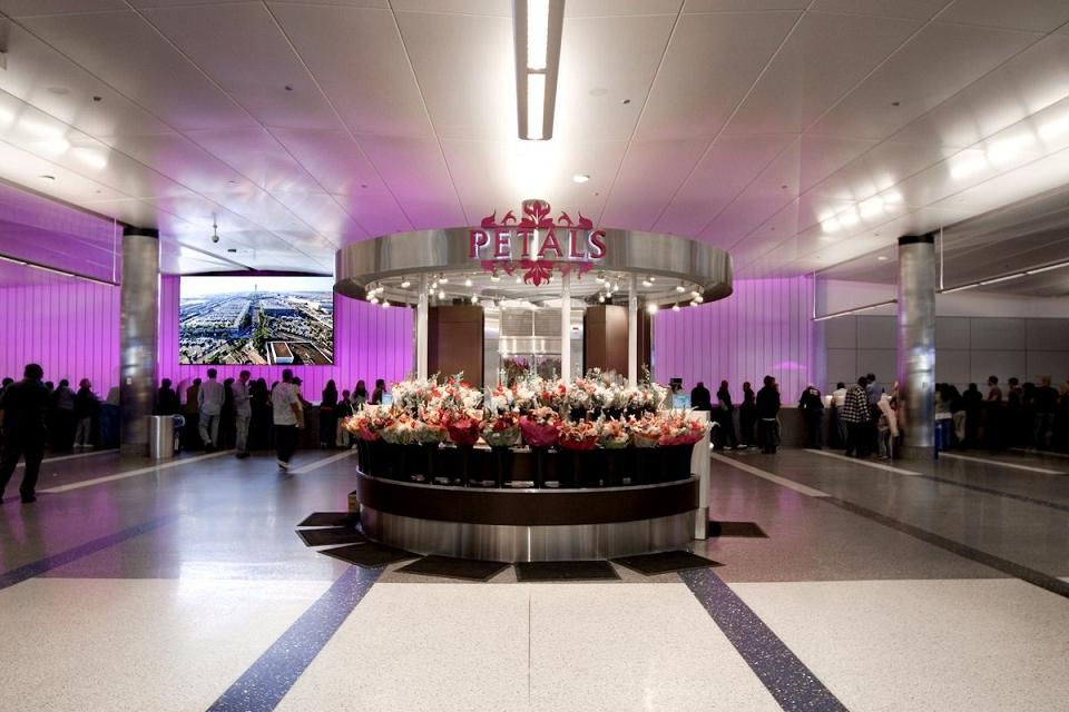

Los Angeles knows a thing or two about facelifts. But even for LA, the renovation of the LAX Tom Bradley International Terminal was a big operation. This project, originally forecast to cost $723.5-million is one of the largest public works projects in the city’s history.
In January of 2007 CNP Signs & Graphics was selected by Los Angeles World Airports and their contractor Clark/McCarthy a Joint Venture to create custom signage for this massive project. For CNP, producing more than 1,200 signs (designed by Hunt Design in Pasadena) for the expanding and revitalized Los Angeles International Airport was the simple part; working in secure zones of one of the busiest airports in the world while installing those signs required a bit more organization.
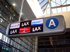
Having worked on many major public works and specialty projects in the past such as Sea World where strict park rules and odd schedules due to the animals limited work schedules, and the LA Metro where workers timed their installations around train schedules, CNP’s professional sign workers know how to be flexible.
Working at LAX Tom Bradley International required not only navigating the seventh-busiest airport with all of the post-911 security in place, but also being as quiet as possible while doing that work. Since installation of large, suspended signage is not inherently a quiet task, special care was taken not to affect travelers. Additionally, for Homeland Security purposes, all CNP Signs & Graphics employees working on the project were required to go through extensive background & security checks to work in the secure areas of the airport.
During the renovation, CNP Signs & Graphics worked closely with Los Angeles World Airports and contractor Clark/McCarthy to manufacture and install extremely functional wayfinding signage as well as integrating programmable digital displays into custom cabinets in the Baggage Claim & Ticketing areas.
In addition to the primary directional signage, CNP Signs & Graphics was also responsible for the custom retail and restaurant signage in the terminal. Installing different logos of the closely grouped restaurant and retail locations required combining manufacturing procedures to achieve the proper look for each business.
This type of project exemplifies CNP Signs & Graphics: A large project that required attention to detail and smart planning. If you’re contemplating reconstruction, let CNP give you a lift on your next public works or specialty project.
I didn’t know CNP could help me with…Building Accent Lighting
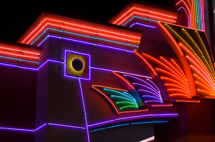

Next time you are out shopping in the evening, pull your eyes from the window displays and take a moment to appreciate the glow coming from the buildings themselves. Building accent lighting has become a popular way to differentiate businesses, and add to their curb appeal. Whether this radiant lighting comes from classic neon or LEDs, many businesses designing new buildings or retrofitting an old one are adding this distinctive feature to their plans.
“A whole range of businesses are incorporating border lighting. The focus these days is definitely on LED. Architectural border lighting is ideal for retail, restaurants, casinos, theme parks – really any business that wants to attract customers after dark,” says Bob McCarter, VP Sales at CNP Signs & Graphics, a company with over 70 years in the sign business.
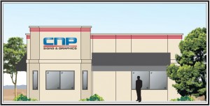
”Businesses often replace old border lighting neon with LED. But it’s not always the right solution,” says McCarter. “Some of the shortcomings of LED include higher up-front cost and fewer color options with less finely-tuned color spectrum compared to their neon counterparts.”
Ease of installation, ruggedness, and operating efficiency remain in the new technology’s favor and mean the LEDs are here to stay, and their myriad uses and performance will only increase over time.
Lighting The Way – LEDs
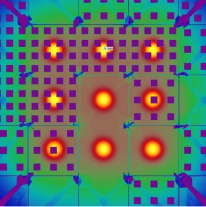

LEDs (Light Emitting Diodes) are extremely energy-efficient solid light bulbs, and they make a nice Christmas light set. Here are a couple of other creative uses of LEDs that set our sign-maker’s hearts aglow.
The Wall
Until fairly recently, LEDs were limited to single-bulb use in applications such as instrument panels, electronics, pen lights and of limited use to the sign industry. Nowadays, we can think big. Bigger than channel letters and pylon signs, bigger than building signs.
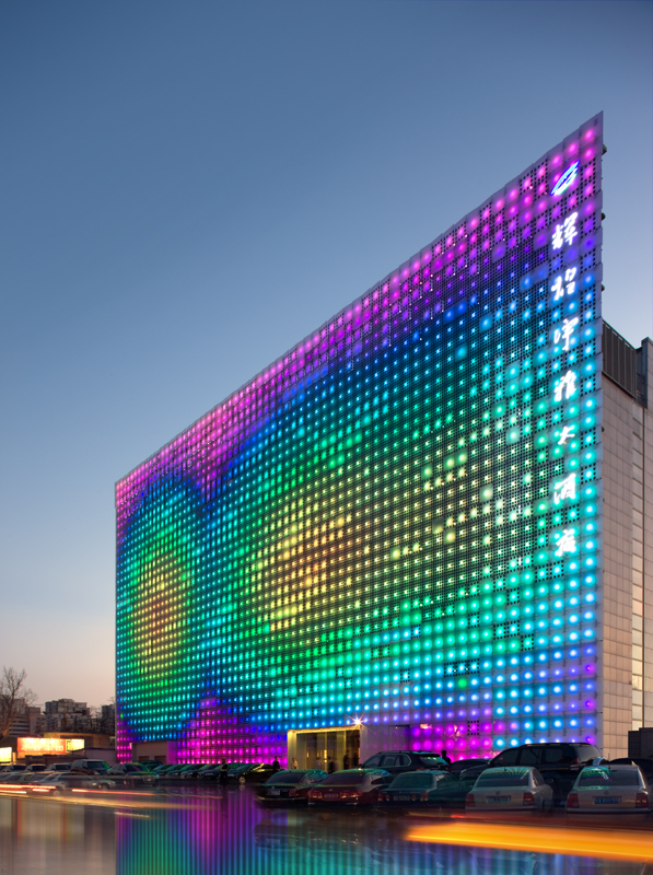
This wall of solar-powered LEDs is called GreenPix – Zero Energy Media Wall. The great LED wall is powered by thousands solar photovoltaic capture cells. It is a self-sufficient, organic system that stores solar energy during the day and uses it to illuminate images by night. You want it? We’ll build you one.
The Water
This is just cool: an LED attachment to your water faucet! Water out of the tap (or shower) is illuminated blue until the water reaches 89 degrees, then turns to red.

LEDs lend themselves to so many applications. If you have an idea for your business, chances are CNP Signs & Graphics can help. LED or analog, CNP fabricators know how to light it up.
Westfield – Valencia Town Center Shopping Mall
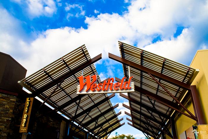

When Westfield Shopping Group needed signs for their upscale mall expansion at Valencia Town Center, they selected CNP Signs & Graphics. Both teams worked closely to develop a cohesive sign program that both blended with the upscale surroundings and did the most important task of directional signage – helping customers navigate their way through the property.
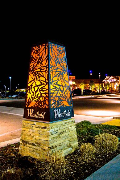
In addition to directional signage, CNP Signs & Graphics also crafted custom signage for The Patios, a luxury outdoor district with cafes, restaurants and fashionable boutiques within the Valencia Town Center. The goal of the signage was to enhance the environment of the mall, creating a unique shopping atmosphere. One of the project challenges was the exterior routed panel portion. Their intricate layout design created a structural challenge to secure the ten foot framings to the existing walls while giving them the effect of seamlessly floating. Additionally the client wanted to integrate indirect or mood lighting to cast dimensional shadows on the surfaces surrounding the panels.
What’s Old is New
Westfield’s plan called for signs with a weathered patina. These new signs would need to have an aged appearance on the outside, and a modern, long-lasting inner structure. To find face metal with these characteristics would have been very costly, but CNP’s professional painters came to the budget’s rescue by using faux-rust painting techniques for a fraction of the anticipated cost.
Experience Counts
When working in such a fast-paced, all-at-once build, organization is everything. With Westfield’s tight schedule and firm opening date, all phases of the work needed to be done right the first time. CNP was chosen in part because of their outstanding record of delivering projects on time and on budget. For the Westfield project CNP project managers, production foremen and field representatives worked together like a well-oiled machine shop to keep the project on track.
“CNP’s professionalism and knowledge has made my job easier knowing that I can count on them to get the job done. The quality of signs, craftsmanship and installation have all exceeded my expectations.” Rex Calderon, Sr. Project Manager Westfield
City of Angels Looks Closely at Sign Regulations

Will the size of the Hollywood sign be reduced by 50%? Probably not. But in 2009 the Planning Department for the City of Los Angeles proposed revising the sign ordinance to include drastic changes to the regulations affecting signs.
These changes would have included major alteration to the size and height of signage allowed within the City.
“Some of these proposed changes were truly Draconian,” says Roy Flahive of CNP Signs & Graphics, a national sign company located in San Diego, CA. “The City of Los Angles wanted outdoor pole signs reduced from 42 feet to 25 feet. The signage allotment for a piece of property would have been reduced from 4 sq feet to 1 sq foot, per lineal foot of frontage, and it would have reduced monument signs by half.”

Proposed changes to LA sign regulations probably won’t extend to the landmark Hollywood sign.
Interestingly, the LA City Building Department admits that at least 50% of the current signs glowing on the streets of Los Angeles are illegal – either unpermitted, improperly made, or improperly installed, possibly all three violations could be occurring on the same sign.
The California Sign Association (CSA) began working with the City of LA to see how both the City and local businesses could best benefit from a thorough review of the current sign ordinance.
“CSA found the City wasn’t really enforcing the current rules they had on the books,” says Flahive, who is also Director Emeritus of the CSA. “The procedure for securing permits in LA is so expensive and time consuming; it seems at times- to encourage cheating, to avoid the whole process.”
A possible solution was found in the creation of a Sign Code Administration Program (SCAP) which establishes a department within the Building Department which can deal with issuing building permits for business signs. This program allows for code enforcement by having inspectors go into the community to inspect new signs being installed, and reviewing existing signage for compliance with the sign code as well building and electrical code requirements.
Both the City of Los Angeles and CSA agree that before citations are issued, business owners need to be informed of the current regulations and what they specifically need to do to bring their businesses into compliance. The goal of the SCAP Program is to achieve voluntary compliance by businesses with the sign code.
“CSA believes most businesses want to be compliant and want to have safe signs on their buildings,” says Flahive. “And the City of Los Angeles doesn’t want to negatively impact businesses, especially in this economy.”
The City of Los Angeles has postponed the new sign requirements and is currently considering implementing the SCAP program.
What Main Street is Really Saying
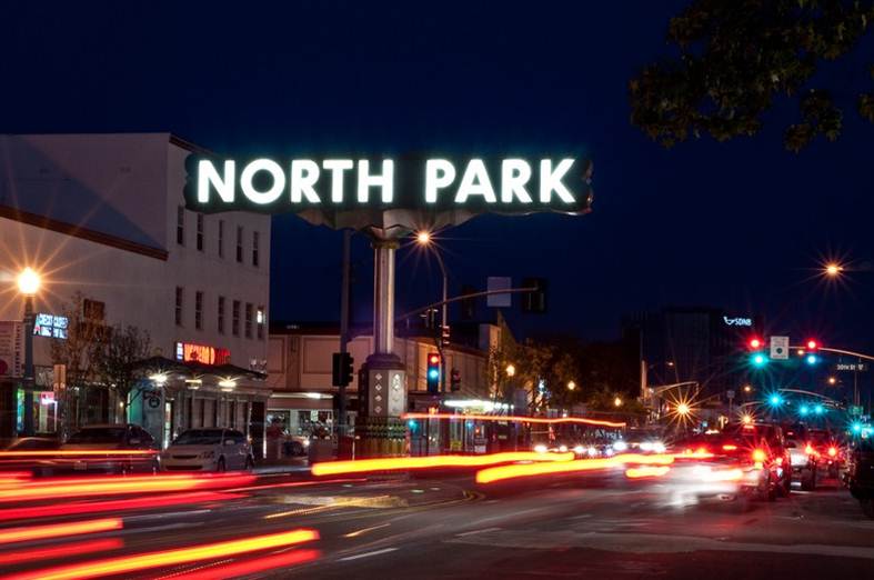
Successful Main Street Sign Programs
Smart cities and counties around the country are focusing on creating attractive business districts and promoting healthy commerce within their downtown areas. Signs help generate business within commercial districts and tax revenues for their communities. With planning and thoughtful attention Building Improvement Districts (BIDs) can use wayfinding and commercial signs to direct visitors and residents in efficient and aesthetically pleasing ways.

Branding your downtown area is a smart way to define a business district
Effective Businesses Bring in More Tax Revenue
It’s easy to get bogged down by numbers, but take a look at this research by the University of San Diego that allows us to see the effectiveness of business signage programs. This study, conducted several years ago, gauges the economic value of on-premises signage.
TABLE 2 – Average Increase in Sales Revenue
Signage Change Fast Food Pier One Imports
Add one monument or pylon sign 9.3%
Add large pole sign (144 sq. ft.) 15.6% 8.6%
Add chain identity to plaza identity sign 7.7%
Addition of two new directional signs 8.9%
Replaced storefront wall sign with larger sign 7.7%
Let’s assume you own a typical family clothing store and add a new, better-designed sign to the business. Here’s how it could impact your bottom line:
Your annual sales $1,757,486
Cost of goods sold 61.8%
Gross Profit Margin 38.2%
Operating expenses (includes other expenses of 1.5%) 36%
Income taxes (estimated at 35%) 0.8%
Income after taxes 1.4%
After tax profit ($1,757,486 x 1.4% or) $24,604
A 7% increase in sales created by the addition of a needed sign, without increasing operating expenses, would cause the following change in profit:
New sales at 7% ($1,757, 486 x .07) $123,024
Gross Profit from new sales ($123,024 x 38.2% Margin Contribution) $46,995
Net Profit (Assumes 35% taxes) $30,547
Total Profit (Original Profit $24,604 plus New Profit $30,547) $55,151
With a modest 7% increase in sales, profits more than double. Increasing profits is one way that signs improve your bottom line. Another way is by decreasing expenses.
Signs are a Long Term Investment in Advertising
There have been several surveys conducted to determine the effectiveness of signage measured before and after installation. For example, one study looked at a Los Angeles auto dealership going in where three previous auto dealers had failed. The new owner, Aztec Motors, spent significant time and money improving the building and lot.
After renovations the owner invested $7,400 on one wall sign and one double-faced pole sign. A survey found the new signage, not the renovations or other advertising, was responsible for a minimum of ten new walk-in customers per week, resulting in at least six additional sales per week.
It took less than a month for the new signs to pay for themselves, and the owner was able to reduce his advertising budget from $16,000 to $4,000 per month an annual savings of $144,000.
Getting In the Zone
If a city hopes to make the most of the land it has zoned for retail use, the laws addressing aesthetic issues will affect their success. Appropriate aesthetics for economic vitality need to balance vibrancy, orderliness, attractiveness and the compelling nature of signage. A top-down approach from city planners on design, font, color and size will effectively reduce the ability of businesses to attract customers, and hinder both their ability to make money and generate tax revenue.
Additionally, lit business signs enhance public safety by lighting commercial areas at night. A well-lit street with an attractive appearance at night is an effective deterrent to criminal activity.
This is not to say all signs should be allowed: cluttered signage and wayfinding diminish the effectiveness of the business district. The best way to avoid disorderly clumps of sign confusion is for BIDs and City Planners to consider signs an integral part of their plans from the beginning.
Roy Flahive with CNP Sign & Graphics was joined by Jeff Aaron Legal Counsel for the California Sign Association, in conducting a seminar on “Signs in a Successful Downtown” for the California Downtown Association in Sacramento, on Thursday September 30th 2010.
For more information on wayfinding, zoning regulations or successful Main Street sign programs, contact CNP Signs and Graphics.
Direction Perfection
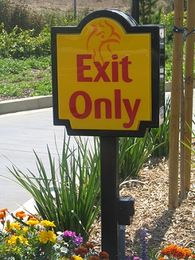
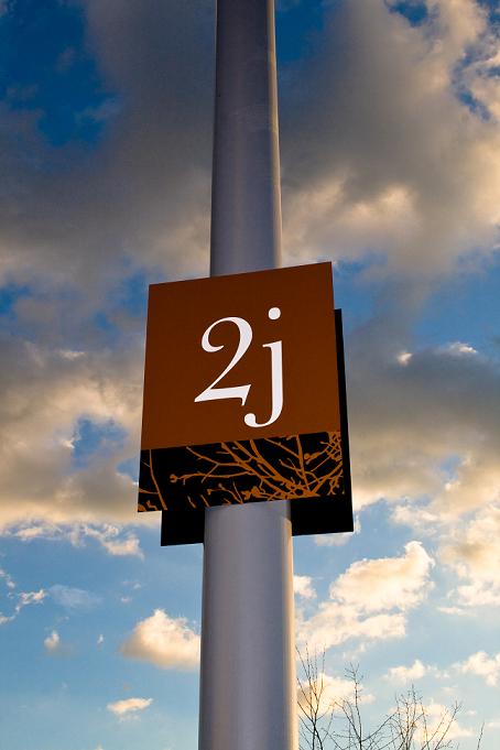
Customers are more comfortable and safer when strong directional and wayfinding signs are present in commercial parking lots. Directional signs are smaller than monument signs, ranging in height from 2 feet to 6 feet, making them easily visible at short distances. These signs are used for conveying directional information, rather than representing a recognizable logo.

El Pollo Loco Directional Signage
Once a customer has reached the place of business, smaller on-premise signs are often used to instruct them which way to go. Placing directional signs at the street can help motorists identify the business and indicate which driveway to use for the entrance.
Directional signs can point traffic to parking areas, drive-thru lanes and registration areas.
These signs are especially important for on-site safety where there is a possibility of confusion for the driver. Keeping traffic flowing smoothly from the street to the final destination is the ultimate goal of any successful wayfinding signage.
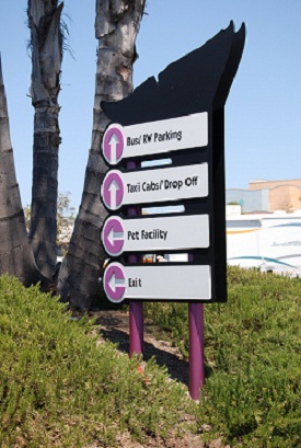
Seaworld parking directional signage
The format of these signs can vary widely from simple post and panel systems, to elaborate way-finding signs. Frequently, these signs are constructed to match the clients building color and logo scheme.
CNP Honored by International Sign Association

CNP Signs & Graphics was one of five sign companies nationally recognized this year by the International Signs Association (ISA) for Excellence in Education.
“This is truly a remarkable achievement for all of these companies,” said Tracey Cook, ISA Director of Education and Communications. “It definitely shows their commitment to ensuring that their employees excel in all facets of the sign industry.”
To read the entire press release from ISA, click here.

