Month: November 2017
Happy Holidays From CNP Signs & Graphics
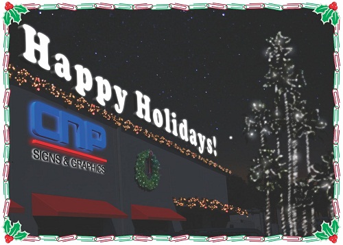
One of the real joys of the holiday season is the opportunity to say Thank You and to wish you the very best for the New Year.
From all of us at CNP Signs & Graphics

Portland Proposes $1000-a-day fines for illegal signs
Business signs in Portland may be fined hefty amounts if proposals by City leaders go into effect.
The Oregonian reports that “to deal with large and prohibited signs in Portland, City Commissioner Randy Leonard is considering new fines of up to $1,000 per day for non-compliant businesses.”
New State laws would authorize fines of up to $1000 a day for the worst violators.
To read the entire post, click here.
Leonard, fresh from his examination of rule-breaking seating areas at food carts, now is having his Bureau of Development Services review a sizable inventory of signs suspected to be larger than the 200 square feet permitted by city code.
Leonard said he hopes to have staff begin working through a backlog of complaints as soon as this week. Leonard said he might propose that funding from the sign industry pay for a full-time city position to enforce regulations.
The fines, he said, could be modeled after a new state statute authorizing up to $1,000 a day, or the revenue generated by the incompliant sign. Leonard said he might propose adopting those fines, outlined in ORS 377.992.
“I want to make sure that the illegal sign owners are truly discouraged from flaunting the city’s billboard regulations and do not simply role the current modest fine into the cost of their doing business,” Leonard said in an e-mail.
Portland Proposes $1000-a-day fines for illegal signs
High Tech Sign Application at CNP
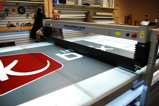
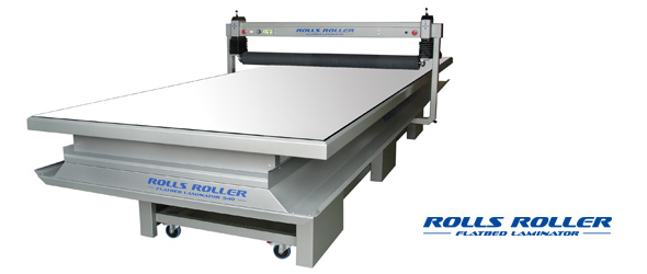
Business signs need to be up as quickly as possible. And nowhere is that more true than when companies re-brand or re-image their look. When faced with the possibility of changing out over a thousand new signs for Jack in the Box, CNP Signs & Graphics found a high-tech way to speed up the process with a large format flatbed laminator from RollsRoller, UK.

This custom laminator measures 8ft by 16ft and allows CNP to lay vinyl images and graphics on to a clear plastic substrait without the typical problems of such a large signface. Historically, laying vinyl images on plexiglass or lexan involved using lots of soapy RapidTech spray and squeegee-ing the graphics into place. This resulted in a wet workspace and the potential for a skewed application. In the past, forming of the wet graphics had to wait until it had time to dry completely.
The RollsRoller laminator, by contrast, is a completely dry process and eliminates many of the possible pitfalls associated with hand-set graphics.
“With such a large face-change project for Jack in the Box, it made sense to streamline our process with a machine like the RollsRoller,” says CNP Signs & Graphics Vice President Rick McCarter. ”Additionally, by being able to immediately form the laminated sheets, it’s about four times as fast as the traditional method of application.”
LEDs Shine in Times Square New Year’s Ball


This year the New Year’s Eve ball that will descend over Times Square in New York City will be the biggest ever. It will also be the greenest.
Using Philips Luxeon Rebel LED modules (32, 256 of them), the ball is capable of producing more than 16 million colors and a dazzling display of patterns. All this while operating with 20% less energy consuption.
The ball weighs over 11,000 lbs. and is built around an aluminum frame that carefully cradles the 2,688 Waterford crystal triangles that are bolted over the LEDs. While at CNP Signs & Graphics we might questions the use of crystal for long-term durability, for one night, it’s probably going to be just fine.
To see more about the history of the New Year’s ball, click here.
To see more pictures of this year’s ball, click here.
For more about LEDs and outdoor signage, contact your friendly and knowledgeable CNP representative.
Happy New Year!
Wayfinding Bliss
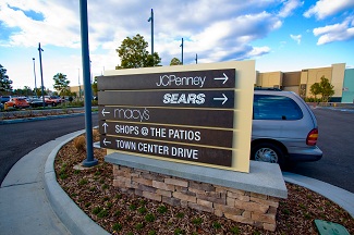
Even repeat visitors to a commercial property, hospital or theme park may need a little help navigating the intricacies of a large complex. When designing any wayfinding program CNP Signs & Graphics works hard to keep visual consistency and simplicity throughout the process.

Simple, clear direction without confusing clutter
The recently completed Pacific Center business park in Sorrento Valley, CA is a good example of how uniformity can also be very visually appealing. Moving from the outside to the inside of the property, we will describe the elements and how they contribute to the success of the project. Experts at Stuart White Design conceived the project for the Pacific Center and CNP implemented two gateway monument art pieces at the entrance of the park. These monument structures are faced in black marble to tie into existing elements of the buildings in the complex. Two large entryway arches were also manufactured by CNP. These were the largest pieces in the project and are the focal point of the wayfinding system.
The size of the arches along with the design intent that they appear continuous when installed made it a challenge for CNP installation experts. Additional bracing and laser guides were employed to make sure the structures were installed plumb along the asymmetrical property entrance.
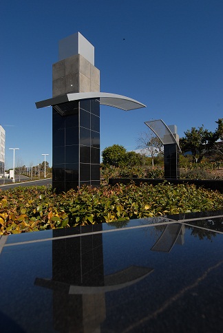
Arched entrance to the Pacific Center in Sorrento Valley, CA
Just inside of the monument signs and entryway arches, CNP also installed four primary directional signs and eight secondary directional signs to guide guests entering the property. These directionals contained design elements similar to both the buildings and the other signage in order to maintain design consistency.
Finally, two stone and tile monument walls were constructed with pin-mounted letters (“Pacific Center”) that helped identify the park from adjacent streets. Good wayfinding matches elements of the property and is properly spaced out to give drivers time to make necessary adjustments. Another element that makes a successful system is the elimination of clutter. Too much information can actually slow the flow of traffic in a complex environment.
Wayfinding achieves its goal when guests can determine where they are, where they want to go, and when they have arrived at the destination.
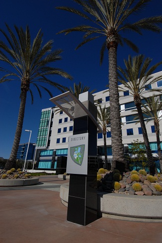
Clear information, clearly displayed defines good wayfinding
Malls Are Cool Again? Hello Westfield.
Back in the 80′s, the Mall was the place to be. But the giant shopping centers have had a tough time over the past ten years says a recent article from CNN. Great signage from CNP Signs & Graphics is a part of package delivering happy customers to waiting retailers at the tony Westfield Valencia Town Center.
“The new generation of malls needs to be built with every kind of store, all of them as easy to access as a Safeway (SWY, Fortune 500). Then”, says Westfield spokeswoman Katy Dickey,” as the positive results from Westfield’s renovations show, customers will stay longer and spend more.”
To read more, click here.
CNP Helps Cook Up Some Bob’s Burgers
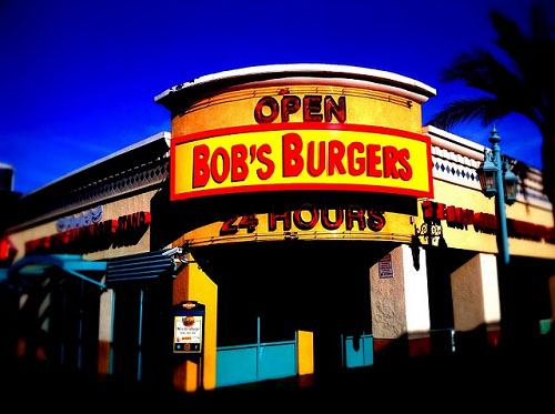
To promote Fox’s new animated series, four Fatburger locations were recently re-fitted with “Bob’s Burgers” signs. These temporary signs were part of a promotion by Fox and their advertising agency, Mile 9. Fatburger restaurants in Hollywood, Las Vegas, Chicago and New Jersey were chosen for the make-over, and CNP Sings & Graphics was picked to produce the signs and make the installations.

This isn’t the first time Fox has used reverse product placement. In 2007 Fox converted dozens of 7-Eleven stores into Kwik-E-Marts to promote the Simpsons Movie. For those of you unfamiliar with the Simpson’s world, the Kwik-E-Mart is a fictional convenience store featured on that show.
The Fatburger/Bob’s Burgers project highlights CNP’s capacity for both extremely quick turn-around work, and nation-wide delivery and installation.
In-N-Out Goes Retro On Route 66
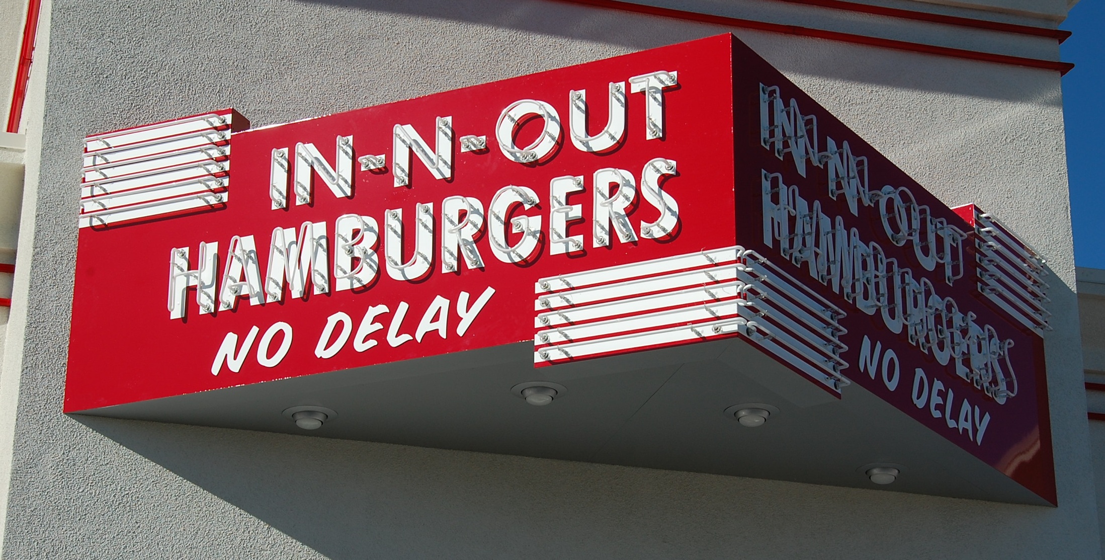

Near the beginning of famous Route 66 in San Bernardino in California is In-N-Out Burger #26. Because of the history of the road and the company, when it was time for new signs at this location, the hamburger company famous for their double-doubles and fresh cut fries went back to their beginnings for inspiration.
When In-N-Out started back in 1948 their signs were neon and read “In-N-Out No Delay”. Today with the help of 70-year-old sign company CNP Signs & Graphics, In-N-Out #26 is decked out in signage befitting the golden age of the automobile out there on Route 66.
In order to achieve the authentic look of early In-N-Out signage, CNP designers went to their corporate headquarters in Baldwin Park where early examples of their signs and pictures of their locations are displayed. Armed with hundreds of pictures of the old illuminated signs, the CNP art department settled on a modified marquee sign (a triangular sign that shows two faces off the side of the building) as their centerpiece.
Keeping the original concept of the In-N-Out signs, the new sign has kept not only the early lettering design but also the exposed green neon lettering that reads “No Delay”. Three other signs were also developed incorporating design elements from the early company signs. However, when the designs called for exposed bulbs (think Las Vegas strip in the 60s) a new product was substituted. The design displays the older style brilliance and sparkling light, but the lights themselves are LEDs that dazzle while using less energy and lasting far longer than the old incandescent bulbs ever could.
In-N-Out executives took the design of restaurant #26 down on Route 66 a step further by carrying the vintage theme to the awnings and wall signs as well as the primary signage. The results are consistently retro, but also recognizable as part of the current design theme of signs across all properties. Because of the company’s love for nostalgia, there may be more vintage signs in their future.
So keep your hands on the wheel and your eyes on the road. And if you find yourself on Route 66 you might want to keep your eyes open for those neon signs twinkling in the twilight. Pull on in for a hamburger served with “No Delay”.
LAX Continues to Grow
The Tom Bradley International Terminal’s “West Wing” is taking shape. The massive public works project started in 2007 is set to revamp the hastily built international terminal built for the 1984 Summer Olympics. The current project employs over 4000 people, including CNP Signs & Graphics, who built and installed directional and wayfinding signage in earlier phases of the build.
For more on that project, click here to see our earlier post.
For the complete story about the terminal expansion from the Contra Costa Times, click here.
